


DAKKII BLUEPRINT #1
COMIC WORKFLOW
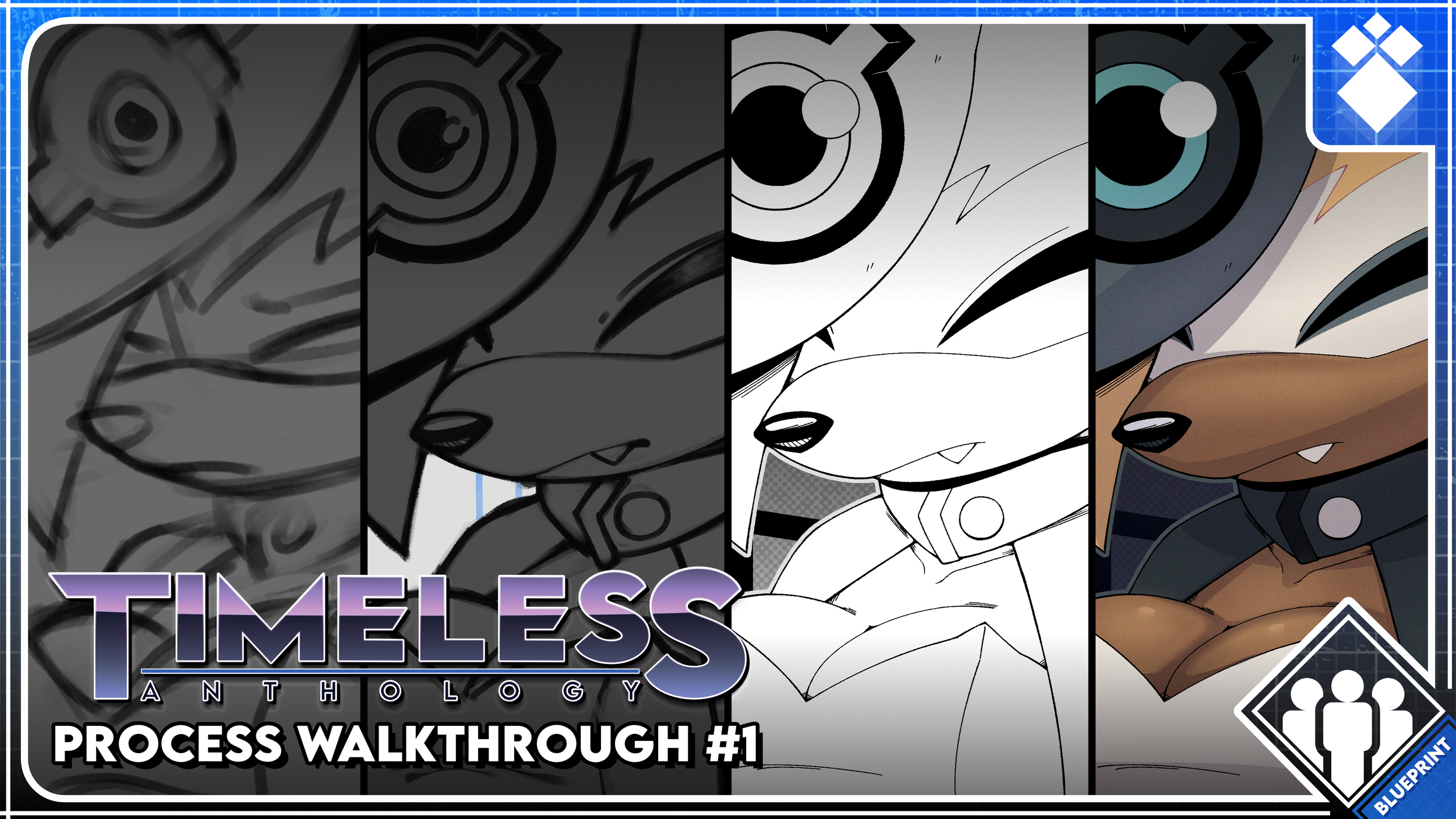
Comics are difficult to make. That doesn't mean they're any less rewarding when you finish! With the weekly release of Timeless Anthology #2 having started today, I wanted to pull the curtain back and show you guys what really goes into a single page of any of my comics.
I am by no means an expert, I'm still very new to the medium. I'm learning new things every day and I'm still going through a bunch of textbooks on the subject! I'll be sure to touch on certain aspects when they become relevant!
I use CLIP STUDIO PAINT EX to make these comics and have been using it for over a decade now. I'm on the Annual Plan that allows me to get updates as soon as they come out. For lettering, I use Affinity, a FREE alternative to Adobe Illustrator that I love so much. Now you don't need these exact tools to do what I do, but they're great tools nonetheless!
SCRIPT
Every story is - at its core - a bunch of words put together in a way that invokes certain emotions from the reader. Comics aren't too different from that, but they have the benefit of using pictorial images to supplement the written word and bridge that disconnect one may have by reading just written prose. Sometimes the pictures can do this all on their own!
I've been writing and drawing for a long time but comics are a relatively new venture for me - contrary to what you may think! I may have mentioned this in passing, but my very first comic, Sequence Zero didn't have a script. That was a mistake.
Comics NEED a script. Especially since characters are most likely not going to be silent the for the whole story. Sequence Zero (while I think we were able to wrangle it in the end) meandered and went on for longer than I had initially planned. I knew when I wanted to go ahead with the next Timeless installment, I wanted to be as organized as possible.
So before I even put my pen to my screen, I wrote a script. I'll only show the one for the first page, since that's what we're focusing on today, but the whole script practically looks the same.
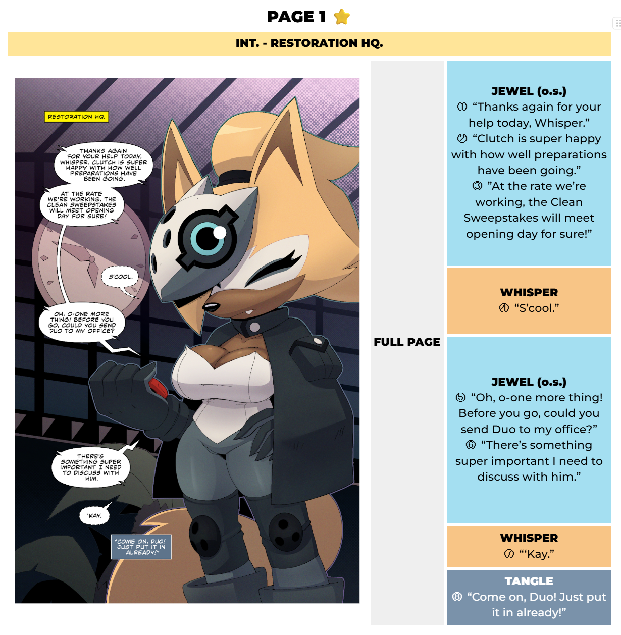
Now this isn't what most comic scripts will look like! Granted, there's no standard, per se. I just designed this to appeal to what I need my script to do for me. I use Google Docs for my scripts because I share these documents with my co-writer/editor, SilvurSilv, and he'll make edits and suggest changes in real time if needed. That, and if any voice actors reach out to me with the intent to dub my comics, I just send them this script so they know how to read the comic and what order the lines are meant to come in.
At the top, we've got the Page Number, which is self explanatory. Usually the best thing to do is to have a page in your Word/Google Docs document for each page in your comic. That way it'll be easy to find where you are when you're scrolling through the script. Works even better if you have a Table of Contents panel like Docs does on the side where you can just click from page to page. Some scripts may spell out the word "ONE" instead of using the numeral. I used the numeral for this script, but I actually prefer writing it out.
Next is the Location: the yellow bar at the top. I use it whenever the setting changes in the story, and you'll see it corresponds to the yellow box (called a "Location Caption") that says "Restoration HQ" on the page preview.
Then we have the Page Preview on the left. This is where the page artwork goes when I want to keep track of how pages flow into each other during the Thumbnailing step. Of course, the finished page wasn't always there like in the example - the page preview will usually have a few versions of the thumbnails (along with maybe some lettering) and other steps before I move onto the next.
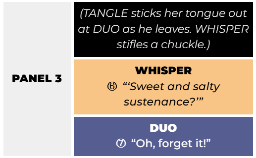
Then we have the Dialogue Lines at the right side of the page. That's where every line of dialogue (spoken or internal) and panel descriptions are placed separated by panels. A Panel description isn't on this page, so here's an example of one from a future page (black box with white text):
When the page is complete, I usually delete the descriptions for easier reading for comic dubbers and voice actors.
When I'm writing, I usually have a mental image of what I want the page to look like, and I make those descriptions so I don't forget them when I begin Thumbnailing. Notice the numbers next to each line? They tell me the order of the lines of dialogue. That'll come up during Thumbnailing, it's really important.
Notice all the lines are color coded, too? It isn't necessary, but it helps me read through the script a lot easier, as I'll immediately know who's on a page at a glance. Google Docs lets me do a lil bit of formatting, so I'm able to put everything into a table and merge the cells together to keep everything clean.
Again, this is bit meticulous just for a script, and yours may not look exactly like this. But that's fine! There are plenty of guides online with simpler examples if that floats your boat. Here! Take my Google Doc template! I hope it'll help you!
THUMBNAILING
Things get pretty straightforward from here on out. After the script is done, and I have the idea fully fleshed out, only THEN do I start drafting pages. Sometimes I cheat if the page is REALLY vivid in my head and I want to commit it to the canvas before I forget it, but more often than not I wait until the script is finished and me and Silv agree on everything.
While I usually treat the script as gospel, there are times where I may add or take away pages if it'll serve the comic better even after its final draft. Not feeling locked into the script is pretty freeing for me, but I try to keep changes to a minimum even in these early stages. Believe it or not, the original Page 1 was actually the current Page 2. A full Whisper page was added pretty recently for better pacing. (And who doesn't love Whisper?)
Usually, a thumbnail will start out like this:
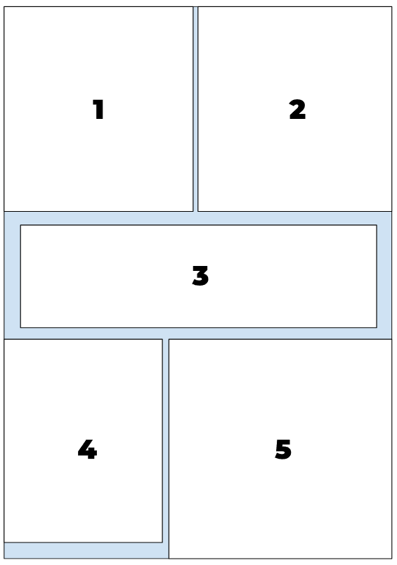
Just a rectangle with a bunch of numbered panels in it. It's not much, but this is the BACKBONE of every page I make. You can make it in Docs, too! It's just one of those funky "Google Drawings" things. It'll be in the template so you can fiddle with it.
This amalgam of squares is important, as it'll help me with the page's panel flow. And since the lines are separated by panel, the numbers also help me quickly identify which panel is which. This layout may change during thumbnailing, but when I'm going through the entire comic, creating quick layouts like these keep the story fresh in my mind, especially since it may be weeks or even months until I reach that page.
For the first page, I actually didn't need to make one of these because I knew exactly how I wanted the page to look from the start. That, and it's a page with no panels. So this wouldn't really have helped me with that.
Here's the actual thumbnail:
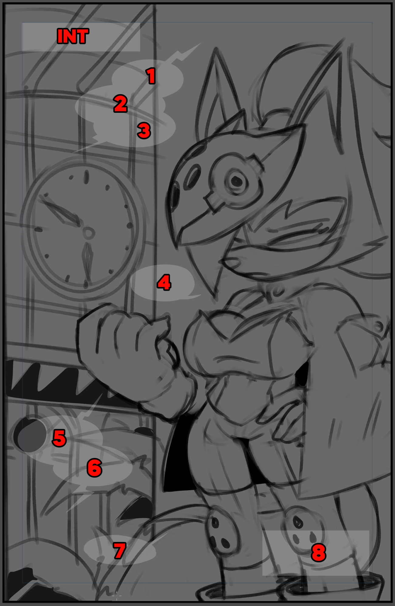
There's our silent sniper! :D
Now this is where those dialogue numbers I mentioned back in the previous step come into play. During the thumbnailing stage, I like to plan out where the speech balloons will go before I start drawing anything. This is ensure that the balloons support the page flow, and so I can be aware of their placement as I'm drawing so I won't put important art where the balloons will be.
You probably notice the background was originally confined to a single panel. I wanted to try out some funky composition and it didn't really pan out. So I stretched it out to a full page background instead!
Thumbnails are supposed to be messy. Something you wouldn't mind throwing away. Just get your idea down on the page before ya lose it! Once it's there, shift elements around, try a new angle or pose! Feel the dialogue doesn't match what you're going for? Go back to the script and change it up! Keep at it until you finally get the page looking how you want it to. That's what these first two steps are for.
PENCILING
Now we're getting into the thick of it. Pencils are just refined sketches from your thumbnails that are ready to be inked. Once you've got your thumbnail looking how you want it to, and your speech balloons in the perfect place, you can move on to committing lines to the page.
For me, this is one of the more time consuming steps. This is where I actually have to think about the perspective and pose and anatomy and such. Sometimes I'll even introduce some light hatching or large spots of black to start defining form and ambient occlusion.
Here are the pencils for this page:
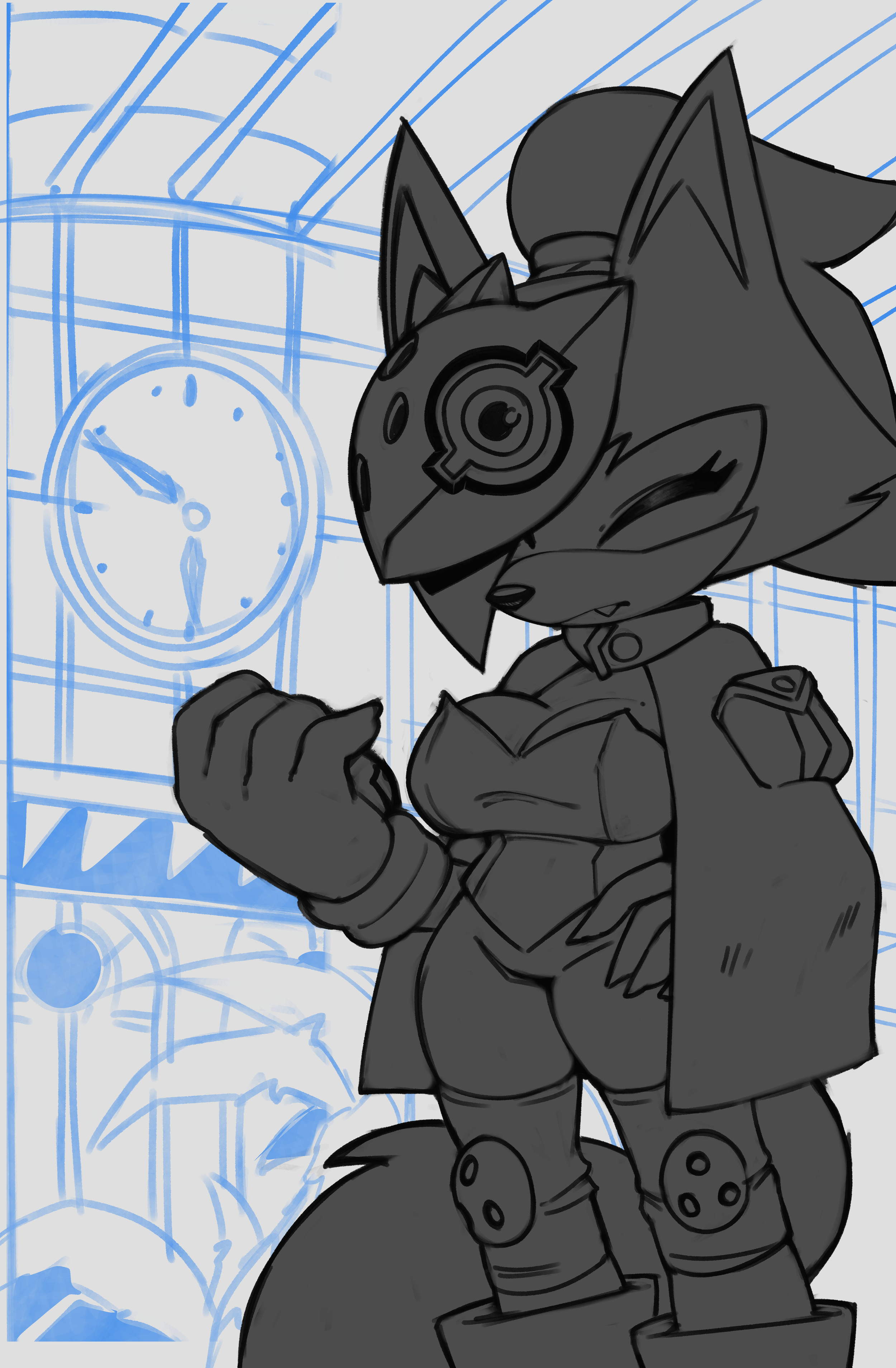
Now I won't lie to you. These pencils could be better. Not in the sense that they're poorly drawn, more so that they're not refined enough. Making comics is a collaborative process, and while I get to avoid playing the game of telephone because I do all the art myself - if I were in a conventional comics pipeline someone else would be inking and would probably be a little confused at what they're supposed to do here, mainly with the background that I extended.
Pencilers have a very important job, because it's THEIR lines that form the foundation for the rest of the page. More experienced and crafty inkers can probably interpret certain lines and decisions on the fly, but decreasing the amount of time an inker has to think about what a penciler meant when they put a certain line down is always a good thing.
Also remember to be mindful of your speech balloon placements. Even during the penciling stage ensure that they're not covering up anything you want to be seen.
INKING
Inking is by far my favorite part of the comic production process. Just black ink on white paper, line weights, maybe some cheeky hatching, I can really turn my brain off in this stage since I had it running on full speed in the penciling one.
I'm very meticulous about getting my inks to look right, almost to an obsessive degree. I must have tweaked my main inking brush at LEAST seven times over the course of the last few months. And slowly but surely, I'm getting things to look how I want.
Here's the inks for this page:
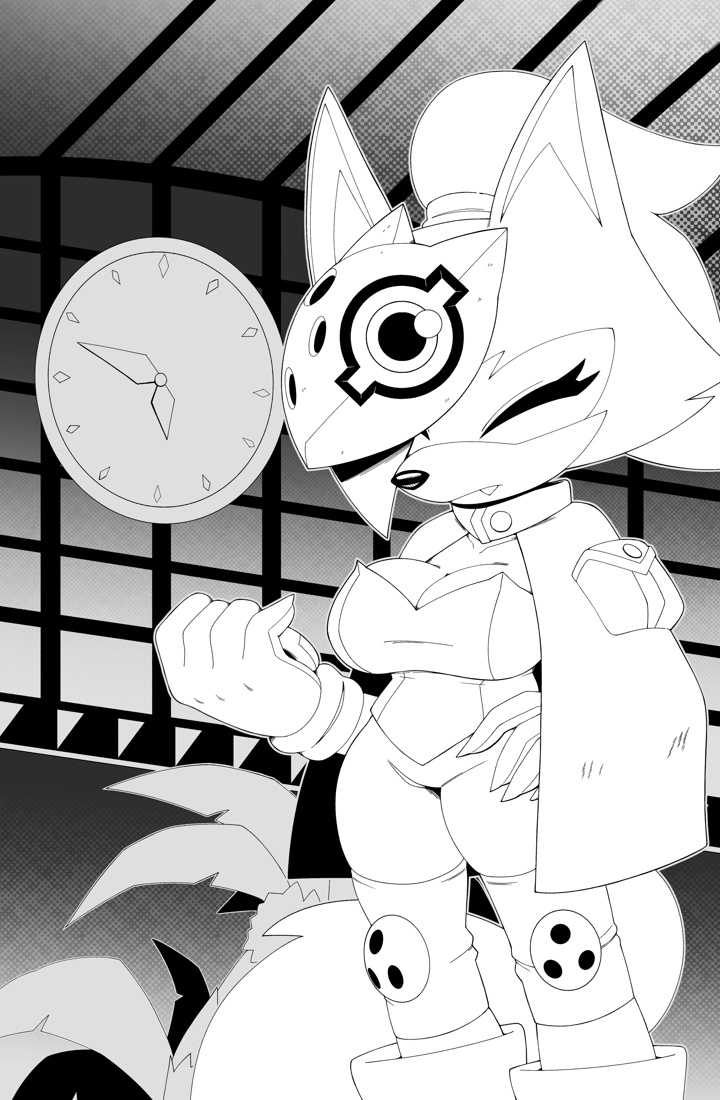
First off, DO NOT work with the background completely white - it'll strain your eyes something FIERCE. I'm only presenting it this way so the inks are easy to see.
Try a semi-light gray! Dark enough for it to be easy on your eyes but still bright enough so you can see what you're inking clearly. The gray I used to separate Whisper from the background in the Penciling example is perfect and is what I use for my background when I draw.
I got really experimental with this page. I learned about halftones a bit ago and I wanted an excuse to use them. You can see the textures in the background to kind of wash out the brighter tones and make Whisper pop without even a drop of color yet. I'll definitely be finding ways to use them more.
Making the comic look as "official" as possible became a goal of mine even in Issue #1. Even though now I believe I've gotten a much better handle on the Sonic style and anatomy than the first issue, There's always room for improvement. I'm always reading and re-reading the comics, saving panels and even entire pages I find interesting on a massive mood board for future reference. I decided a long while ago that I'd try and emulate certain artists in certain stages.
For inking specifically, Adam Bryce Thomas and Evan Stanley were my primary figures. I tweaked my brush texture and its default size to better fit their work. I actually shifted from thicker lines in my older works to MUCH thinner ones because of these studies, and I've come to prefer them. I also recommend that you turn OFF Anti-Aliasing, it's a feature most raster-based software have that smooth out the lines you put down by slightly blurring the edges. I used to do leave this on, but not anymore. Having pixel-perfect lines actually works WONDERS during the Coloring stage, because in Clip Studio you can turn off AA for the Fill tool too, and when you have pixel perfect inks with pixel perfect dump fills the process is MUCH LESS frustrating.
Even now I continue to iterate and still study the comics, even the Archie greats like Tracy Yardley I peruse from time to time. It's my hope that one day I'll have a style to call my own, but for now, emulating those who came before me will be what gets me there.
FLAT COLORS
Flat Colors, or "Flats" is the term used to describe the pure colors that are put onto the page without any shading done just yet. It's pretty straightforward.
Here are the flats for this page:
Again, wanting to be true to the comics, I dug around for Whisper's model sheets. They're actually really easy to find, and I really appreciate the IDW artists for making them available publicly.
Whisper's colors are pretty true to her design, even though I prefer to slightly desaturate her fur as to not make it pop too much.
But look at the BACKGROUND! The halftones in the previous step even now are carrying weight! The values in the back allow for Whisper to naturally pop against it, and I didn't even have to do any shading.
I even colored in some of the lineart on Whisper to make things blend a little better, like the fur pattern on her face.
RENDERING
Now, I had to discuss with myself about whether or not I should have left the page with just the flats. It looks pretty good, and there are some IDW issues with pretty minimal shading. Not to mention the amount of time I'd be saving per page if I just paid little attention to the lighting.
But I knew I wouldn't be satisfied with the result if I just left the flats as they were, so I went on to devise a rendering scheme to help guide me through the process:
The picture above is eventually what I settled down with. It's a pretty simple scheme. A single shadow with a terminator (that's the darker blue line along the edge of the shadow right before it touches the lighter area), and some ambient light behind it.
Two highlights, one softer and at a lower opacity, and then a way brighter specular on top. And I rarely do this, but coloring the lineart to communicate intense light makes for very strong visuals.
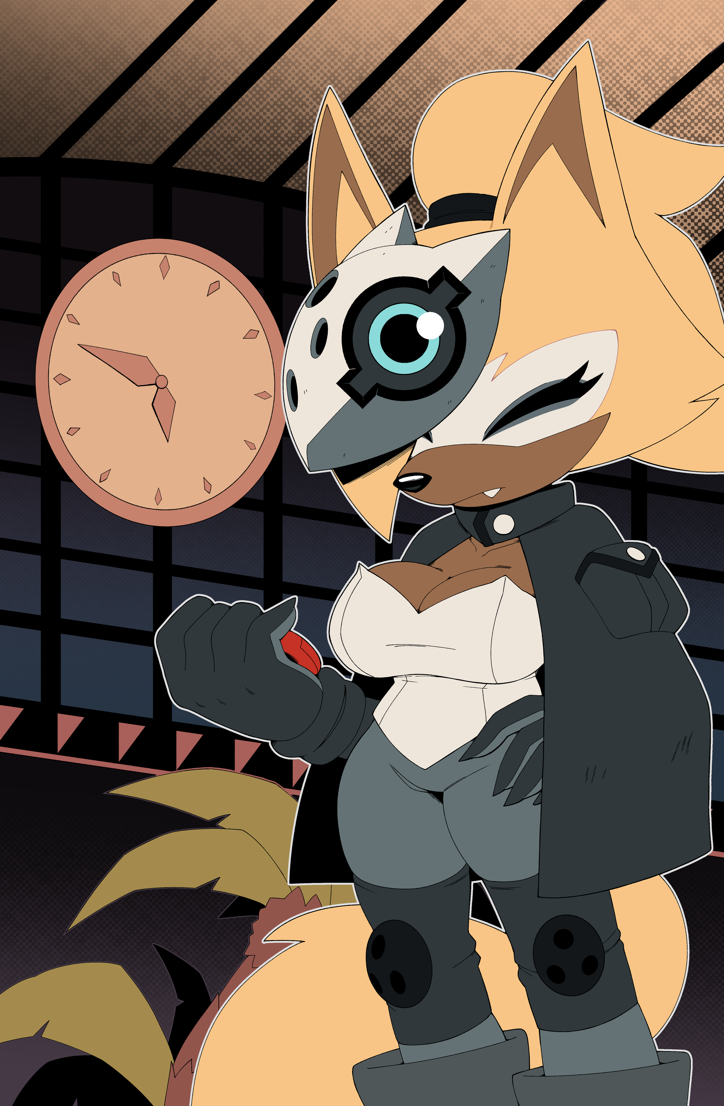
But even though I had this guide, I didn't really follow it for this page...or at all. Here's how it looks rendered:
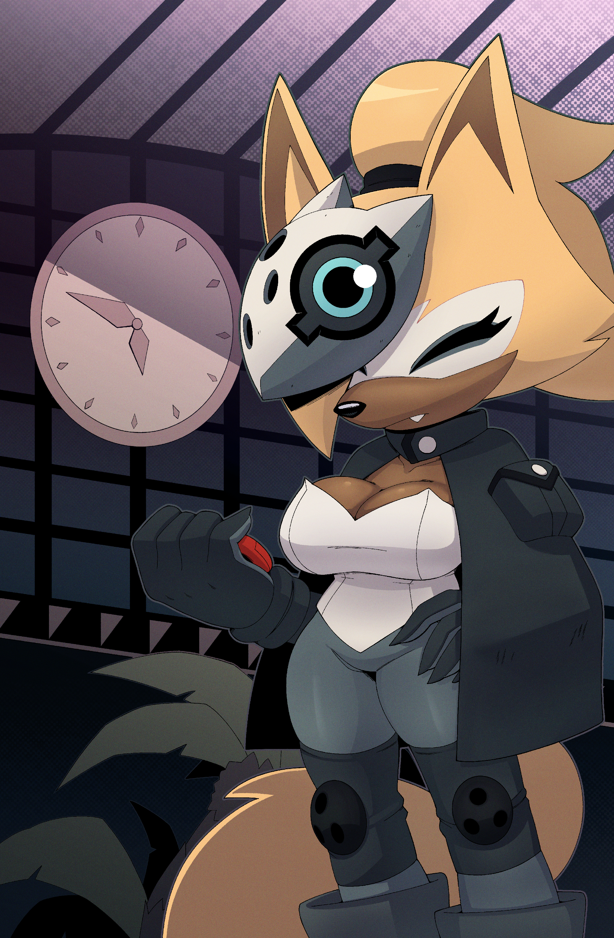
Now, I'm not a master at rendering. My forms aren't always the best, and often times it feels like I'm just putting shadows down in places that feel good than actually taking a light source into account. But I feel I make it work even with my current skill level. In future pages I attain the mindset of treating rendering like inking, and I start hatching the edges of shadows that face the light, or anywhere that I want to add extra texture to. I do rarely use the airbrush to soften certain edges out, but I prefer to keep them sharp mostly.
You can also probably notice a slight noise texture on this page. Yeah, it's on all the pages! Not only does it give the art some aesthetic bonus points, but I've seen quite a few IDW issues with a similar texture, so I decided to make good use of it here.
Once I made this texture for the first page, I would just copy and paste it for future ones so I don't stress over remaking the texture every time I need it.
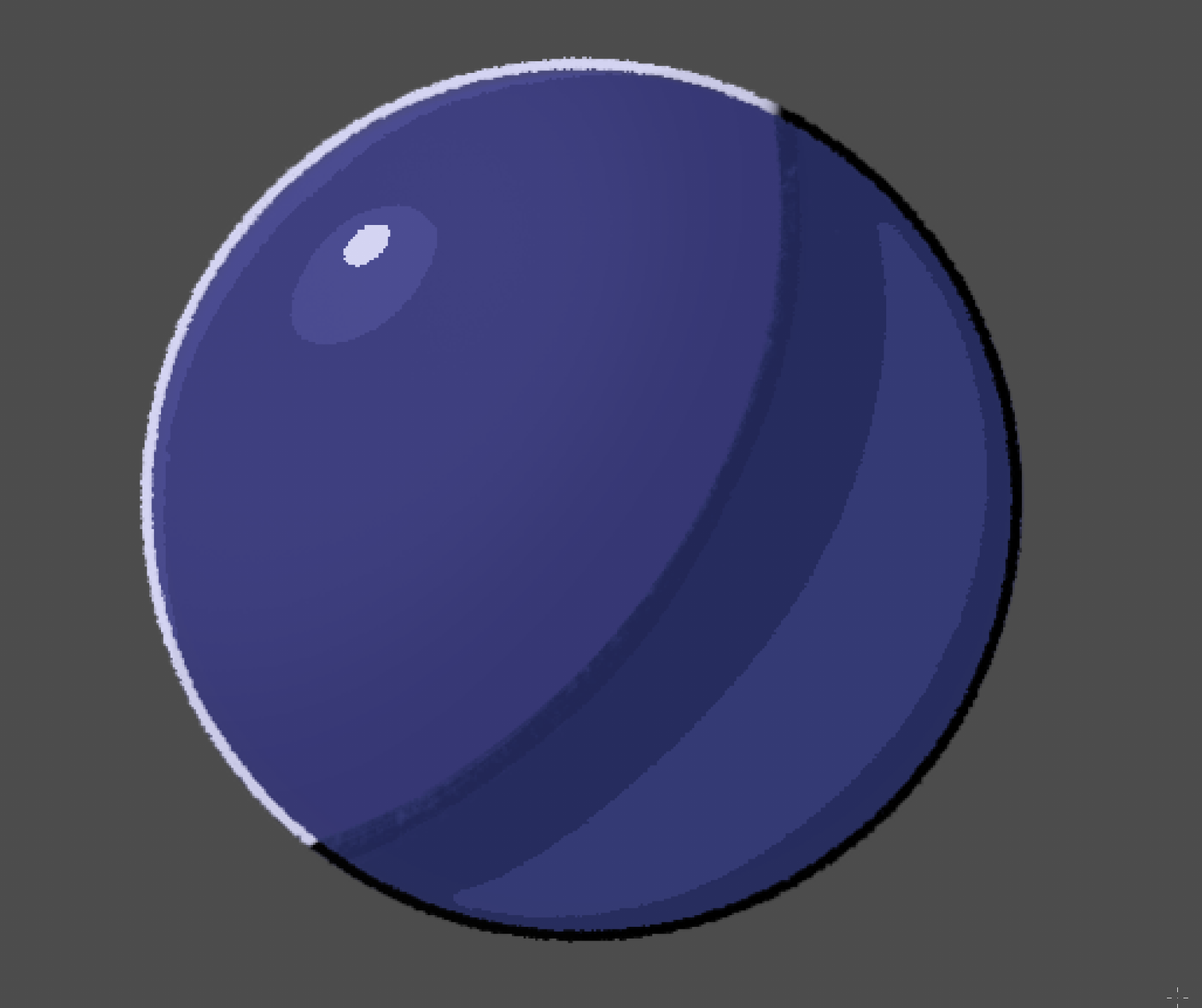
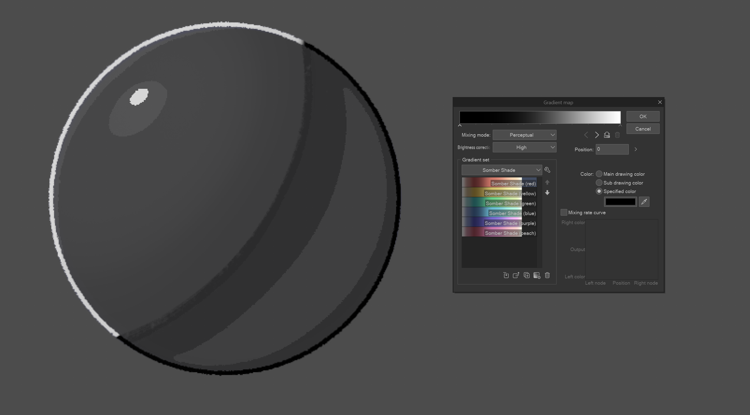
I also like using gradient maps! Gradient Maps are a powerful tool that basically assigns colors to your values via a gradient. It's super useful and I'll show you a few examples with that sphere I posted before.
Boom, now the sphere’s depressed. :(
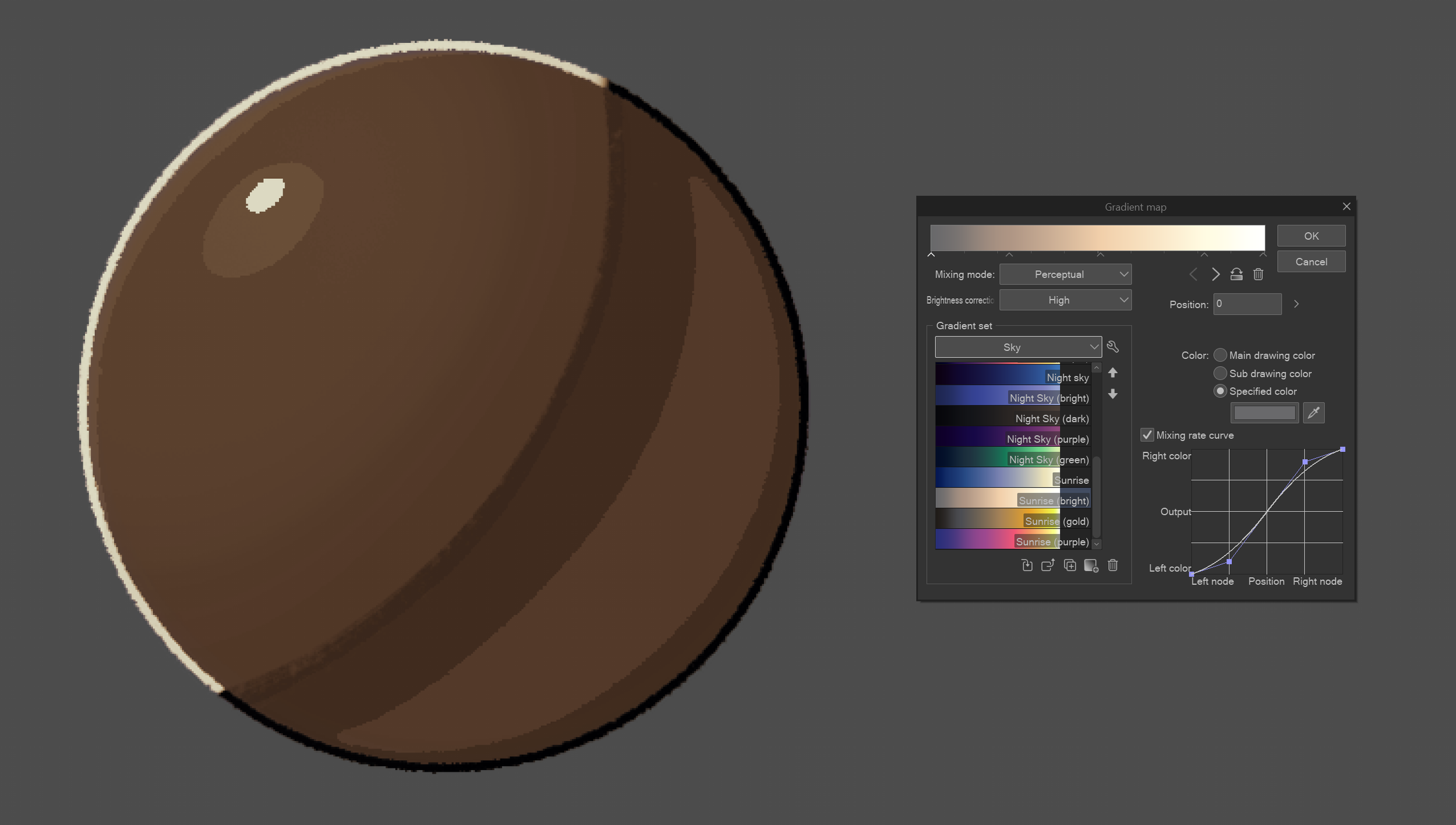
Spherical sepia!
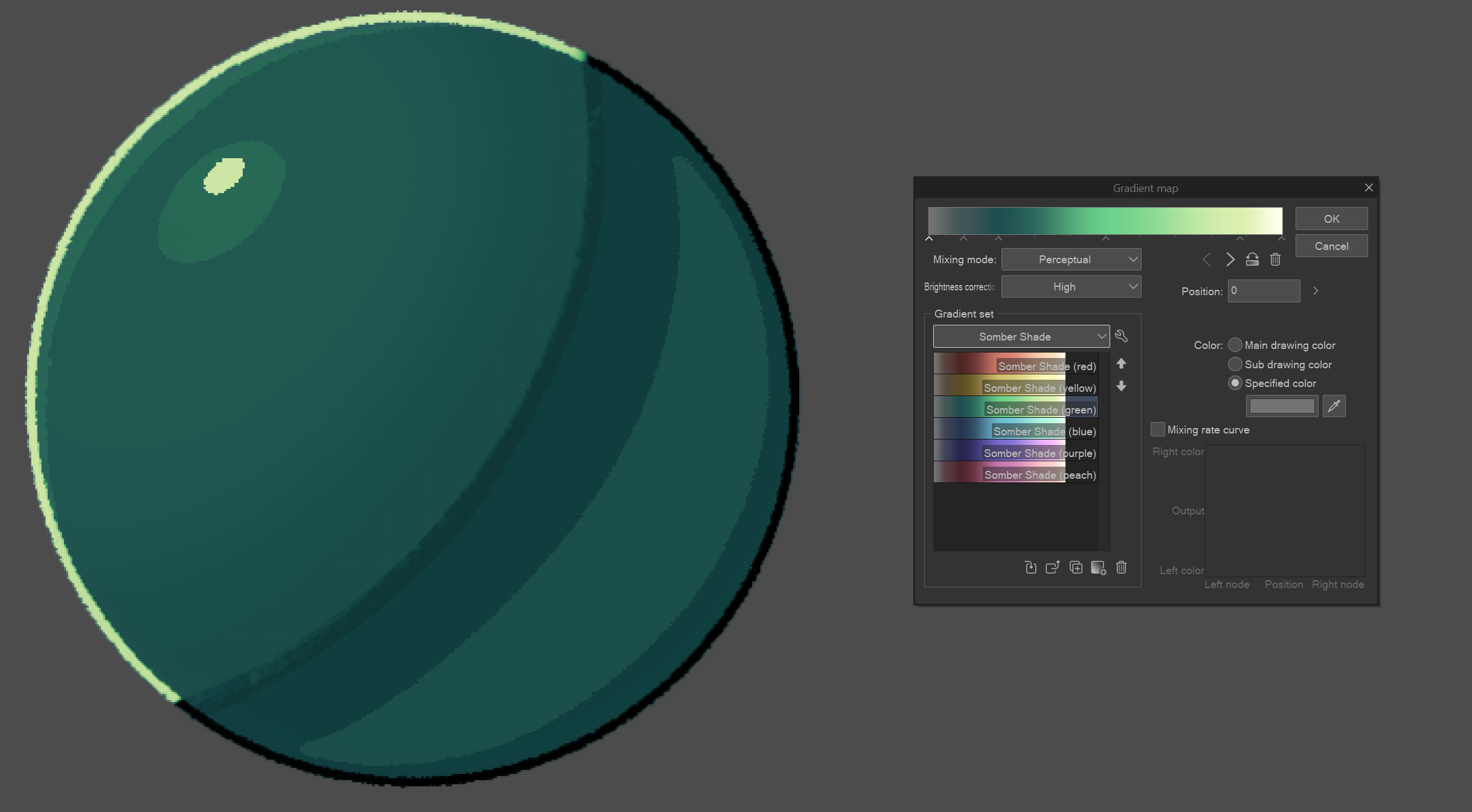
G r e e n (?)
These are really basic examples. You really have to be familiar with your values for it to work well. I used a gradient map to adjust Whisper's colors and make her look like she's actually inhabiting the space she's in. She's in the lobby of the Restoration HQ a bit past sunset and everyone's turning in for the night, so things are winding down, lights are turning off, essentials are being left on, the works! Purples and blues and some desaturation for the background.
Everyone tackles color differently. I'm not the guy to go to for color theory so I haven't the foggiest about to explain certain color choices I make. I usually just pick from similar backgrounds I find in the comic if they fit the scene enough, but unless you're making a manga, a good color scheme can make or break your scene. Try and come up with a color script, or a bunch of images that fit the mood of whatever scene you're working on.
LETTERING
Lettering is another fun part of the process for me. Thanks to the planning I did back in the Thumbnailing and Penciling pages, all I gotta do is put words in balloons and I'll be good as gold!
Well, SORT OF.
Lettering is an art all on its own. It's something I'm also relatively new to...at least to the proper way of doing it.
I had picked up this book called "The Essential Guide to Comic Book Lettering" by Nate Piekos close to the end of preproduction for Issue #2. Reading it opened my eyes to why words look the way they do in comics, and I believe it's an essential read if you wanna be a letterer, too.
Back in Sequence Zero, I was just doing whatever. My speech balloons were all over the place and I wasn't thinking about the panel flow or how easy the story would be to read. For Timeless, I knew I needed to change.
Here's what the lettered page looks like in Affinity:
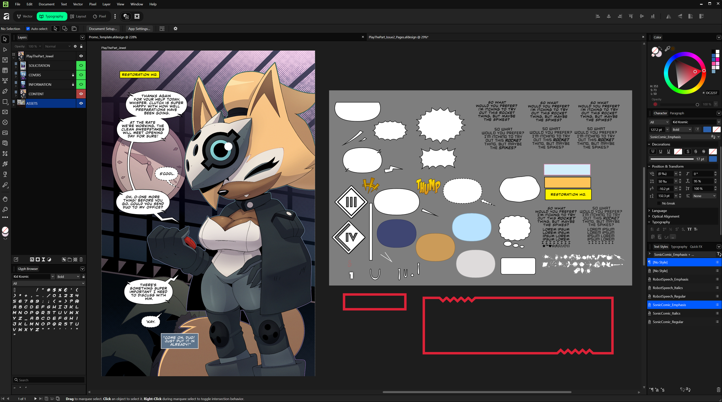
There's a lot of different things going on here, and I can't explain EVERYTHING, but I'll touch on the important stuff.
First off, the font for the dialogue. Good GOD you don't know how long it took me to find the font the actual comics use. After DAYS of image searching and mean-mugging the 10th "similar fonts" notice I got, I finally found it! It's called CCMildMannered, and you can click on it to purchase a license for yourself. It's pretty important to get a license for fonts because you can't monetize the products you put them in without one, and while Timeless will eventually be free to read for everyone, it is still being monetized in part. Usually I'd just find a free download and be done with it, but since I want CCMildMannered to be my main font for ALL my comics moving forward, buying a license was the best thing to do.
You can see a bunch of stuff on the right inside that grey rectangle over there, and that's just where I keep all my lettering assets. I have presets on the bottom right for font weights, like for Bold and Italics and Bold Italics when I need them. Quick note, usually when words need to be emphasized, they're usually done with Bold Italics, at least in the IDW comics they are. There are instances where I've seen just regular Italics being used, like for internal monologues or captions like Editor's Notes.
As for things like sound effects and the like, I have hundreds of fonts I spent several evenings downloading. I got most of them from Blambot! They have a bunch of free fonts you can nab.
I'm unsure if I HAVE to say this, but I'm not sponsored or anything. I just really like their fonts. :)
A lot of the word balloons you see there I had to make by hand, or I lifted the shapes directly from the pages for maximum authenticity. Since Affinity is a vector-based program, I can adjust whatever I need, from strokes to fills, and gradients, and it's all non-destructive (mostly)! You just have to be careful with how you go about creating your assets, but having a big file with all of them will do you some good.
I letter all my pages in one big file to I can reuse assets when I can and save time on making new ones. I usually go through the IDW comics to find some interesting lettering shapes to save for later, and if I'm lucky enough I'll be able to recognize or find the font for them to use for myself. I'm not great at making my sound effects pop off the page like the professionals do, but I hope to be able to share some more interesting details when I'm a little more experienced.
One last thing: reading direction. Standard American comics are usually read from left to right, and from top to bottom. I try my best to keep this in mind as I'm planning out panels and word balloons during the Thumbnailing stage.
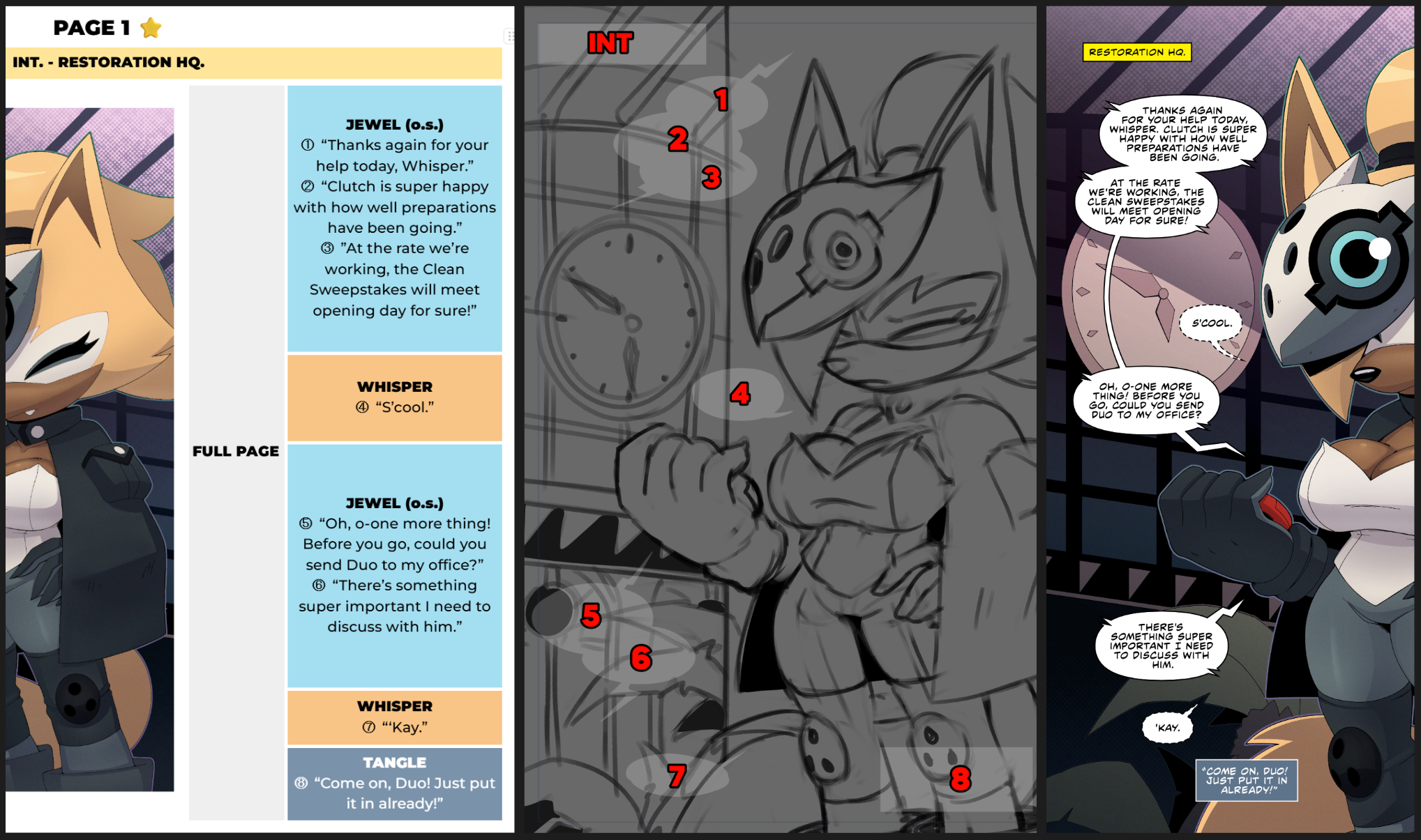
See the difference between the finished lettering and the thumbnails? The balloons and captions were all over the place. That'll often happen, but that's why we have the penciling stage to finalize things. Thumbnails are just for making the idea exist, they're meant to be iterated on and refined later on, so don't be beholden to something you drew before if you feel you can make it better.
Notice how these speech balloons follow an arc that go from left to right? You're already reading from top to bottom, and this way, Whisper can have her side of the page unobscured, and the story can begin on the left.
Another tip is to point the balloon tails in the direction of the next line of dialogue when you can. You won't be able to do it ALL the time, but it'll also help a bit with flow!
Like I said at the beginning...making comics is HARD. Especially for one person. There is a lot of thought and planning and time that go into participating in this amazing medium, but I wouldn't want it any other way. Now that I watch less television and stuff online, I find myself slowly transitioning back to comics. I grew up with the medium and I can't say how excited I am to be able to work in it.
I'd like to be a professional one day, that's the dream. Getting to work with a team on a comic or even with IDW for Sonic would make my lifetime. But I'm happy where I am now. As I strive to improve, I can hope that more opportunities will come around.
I really do hope something in this makeshift guide helped one of you understand and maybe even appreciate the process a lot more. I'm working hard to make things that people enjoy, and I don't plan on stopping any time soon. You shouldn't either. So grab a pencil and draw something YOU'D put on YOUR fridge that YOU spent with YOUR money YOU earned from the last crazy successful comic freelancing gig YOU took.
Yes. YOU. 🫵
Get out there and make something awesome. I can't wait to see it. ❤️
Oh and here's the source file for the Page 1, as a gift for making it to the end! (Heads up though, the Source File is only for the pure artwork. You won't find the lettering as it was done in Affinity.)